NovaBank
A mobile-first banking experience that turns a scattered financial life into one clear, confident view.

Overview
Most banking apps are built like ledgers long lists of numbers with no story attached to them. NovaBank started from a different question: what would a banking app look like if it treated your money like a wealth portfolio, not a checking account?
I designed NovaBank end-to-end as a figma prototype fintech concept: a secure onboarding and identity verification flow, a home experience built around net worth rather than raw balances, and the full set of day-to-day financial actions transfers, cards, bills, airtime, QR payments, investments, and savings goals unified under one visual system.
The result is a 20+ screen product spanning six connected flows, designed to feel as trustworthy as a private bank and as fast as a consumer app.


The Problem
Digital banking apps tend to fail in one of two directions:
Utility-first apps (transfers, bill pay) are fast but feel transactional they show you what happened, not where you stand.
Wealth-management apps are reassuring but slow, burying simple actions like "send money" under menus built for advisors, not everyday users.
NovaBank needed to do both: give users the immediate utility of a daily-use banking app, while framing every screen around a bigger question is my money working for me?
That tension shaped every decision below
Design Approach
I treated NovaBank as three layered problems, solved in sequence:
Trust, first. Before a user sees a single dollar figure, they need to believe the app is secure. This meant designing identity verification as a moment of reassurance, not friction.
Orientation, second. The Home screen had to answer "how am I doing?" in under two seconds — before it asks the user to do anything.
Speed, third. Every recurring action (send, pay, top up) needed to be reachable in as few taps as the best single-purpose apps, without breaking the wealth-first frame established on Home.
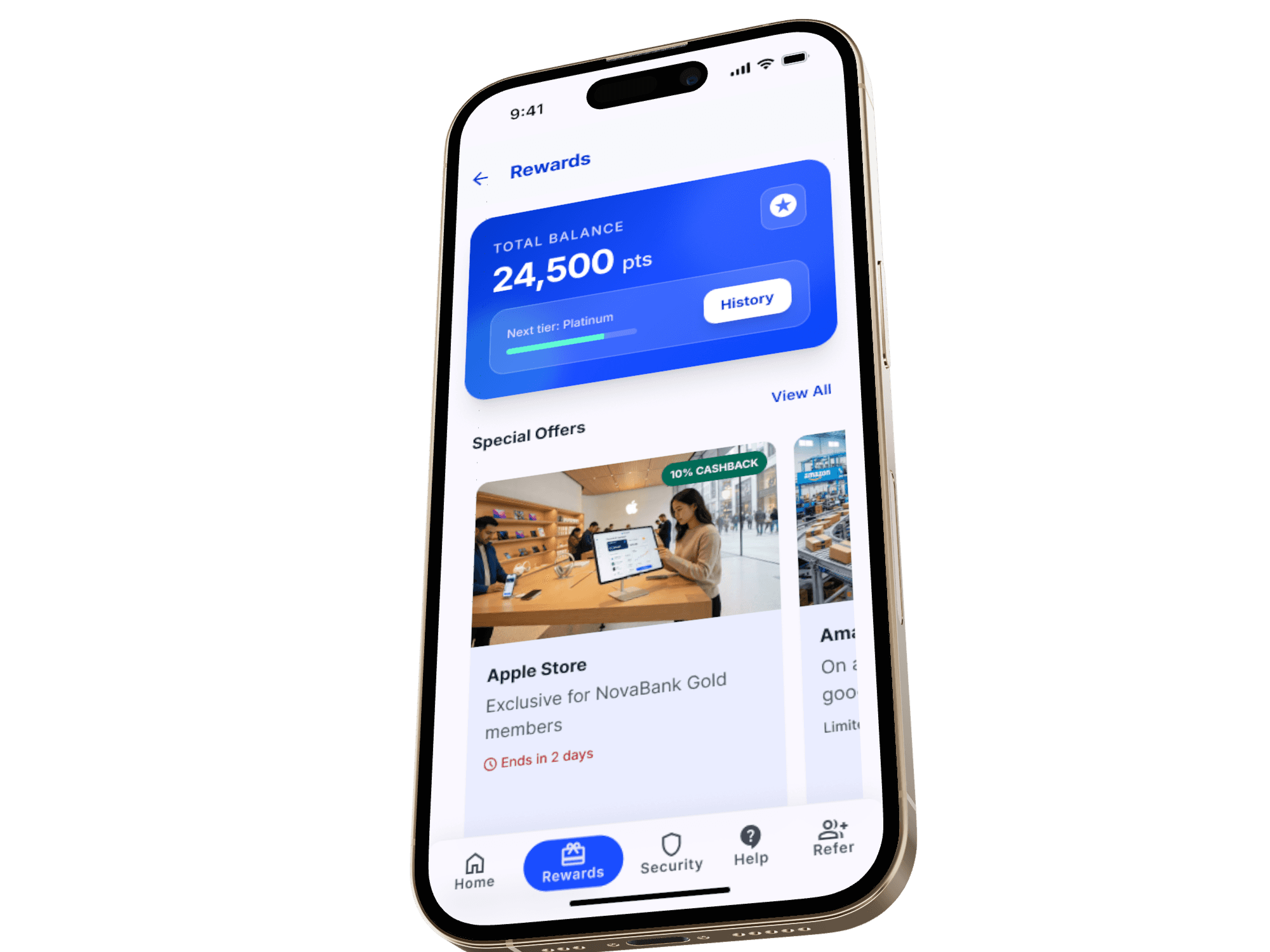
Flow 1 — Onboarding & Biometric Verification
The first impression of any banking app is a security impression. Instead of a static splash screen, I designed an animated sequence a WebGL fluid gradient shifting from deep blue to teal, with floating 3D icons for currency, cards, and insights paired with a visible "Establishing secure connection..." status. It's a small piece of choreography, but it tells the user this app takes your data seriously before they've typed a single character.
From there, identity verification follows a deliberately short, guided path:
Identity input → document upload → facial recognition liveness check → verification success
I designed the facial scan step as a full-screen, high-contrast moment with a single clear focal point no competing UI, no ambiguity about what's being asked. Real-time biometric KYC flows are where users drop off most in fintech onboarding, so every screen in this sequence carries one instruction and one action, nothing else competing for attention.
Flow 2 — Home: The Wealth Overview
This is the screen the whole product is built around. Instead of a single balance number, Home opens with three stacked cards:
Total Balance with month-over-month change (+2.4% this month)
Savings, shown as progress toward a goal (65% of a $65K target) rather than a static figure
Investments, framed by performance ("4 assets performing well") instead of just a number
This is the core design decision of the whole app: every figure is paired with momentum, not shown in isolation. A balance alone tells you where you are. A balance with a trend line tells you where you're headed which is the actual question users open a banking app to answer.
Navigation sits in a fixed bottom bar Home, Payments, Cards, Insights, Profile keeping the entire app one thumb-reach away at all times.
Flow 3 — Cards
Card management is designed around a simple but often-overlooked insight: physical and virtual cards need different levels of visibility and control, so they shouldn't share the same default state.
A Physical/Virtual segmented toggle sits directly above the card stack, letting users switch context instantly rather than scrolling through a mixed list.
The card itself uses a dark, brushed-metal texture with masked digits deliberately closer to a premium physical card than a flat fintech UI card, reinforcing that this is your card, not just a database row.
Below the card, three single-tap controls lock, reveal number, and view PIN put the highest-anxiety actions (lost card, fraud, forgotten PIN) exactly where a stressed user would look first, with zero menu-digging.
Flow 4 — Transfers
The send-money flow follows four steps Send → Recipient → Confirm → Success kept intentionally linear with no branching, because transfers are the one flow where users want zero decisions beyond "who" and "how much." Recipient selection, amount confirmation, and the success state all reuse the same card-based visual language from Home, so the flow never feels like it's left the app's core experience to enter a separate "utility" mode.
Flow 5 — Investments & Spending Insights
Where Home gives a summary, this flow gives depth. Individual investment screens break down performance with clean line charts and per-asset detail, while a dedicated Spending and Financial Insights view surfaces patterns where money is going, not just where it went. The goal was to make analysis feel like a natural extension of checking your balance, not a separate "advisor mode" bolted onto a consumer app.
Flow 6 — Everyday Payments: Bills, Airtime, QR & Savings Goals
The remaining flows cover the transactions people make constantly but banking apps often treat as afterthoughts:
Bill Pay and Buy Airtime — quick, form-first flows optimized for repeat use
QR Payment — a full-screen scanner UI stripped of all non-essential chrome, since speed at checkout matters more than branding here
Savings Goals — a create-goal flow paired with a goal-detail view showing progress visually, extending the same "momentum over static numbers" principle from Home into a feature users actually return to check
Design System
Every screen shares one restrained system: a blue-to-violet gradient identity for security and brand moments (splash, cards, CTAs), clean white surfaces with high-contrast typography for data-heavy screens (Home, transactions, investments), and a single accent green reserved specifically for positive financial movement growth, active status, completed actions so the color itself becomes a signal, not decoration.
What This Project Demonstrates
NovaBank isn't one screen or one flow it's a full financial product system: security first onboarding, a data-dense but calm home experience, and six distinct utility flows that all speak the same visual language. Designing it end-to-end meant constantly balancing two competing needs the reassurance of a wealth platform and the speed of a daily use app and resolving that tension consistently across 20+ screens rather than solving it once and letting the rest drift.

