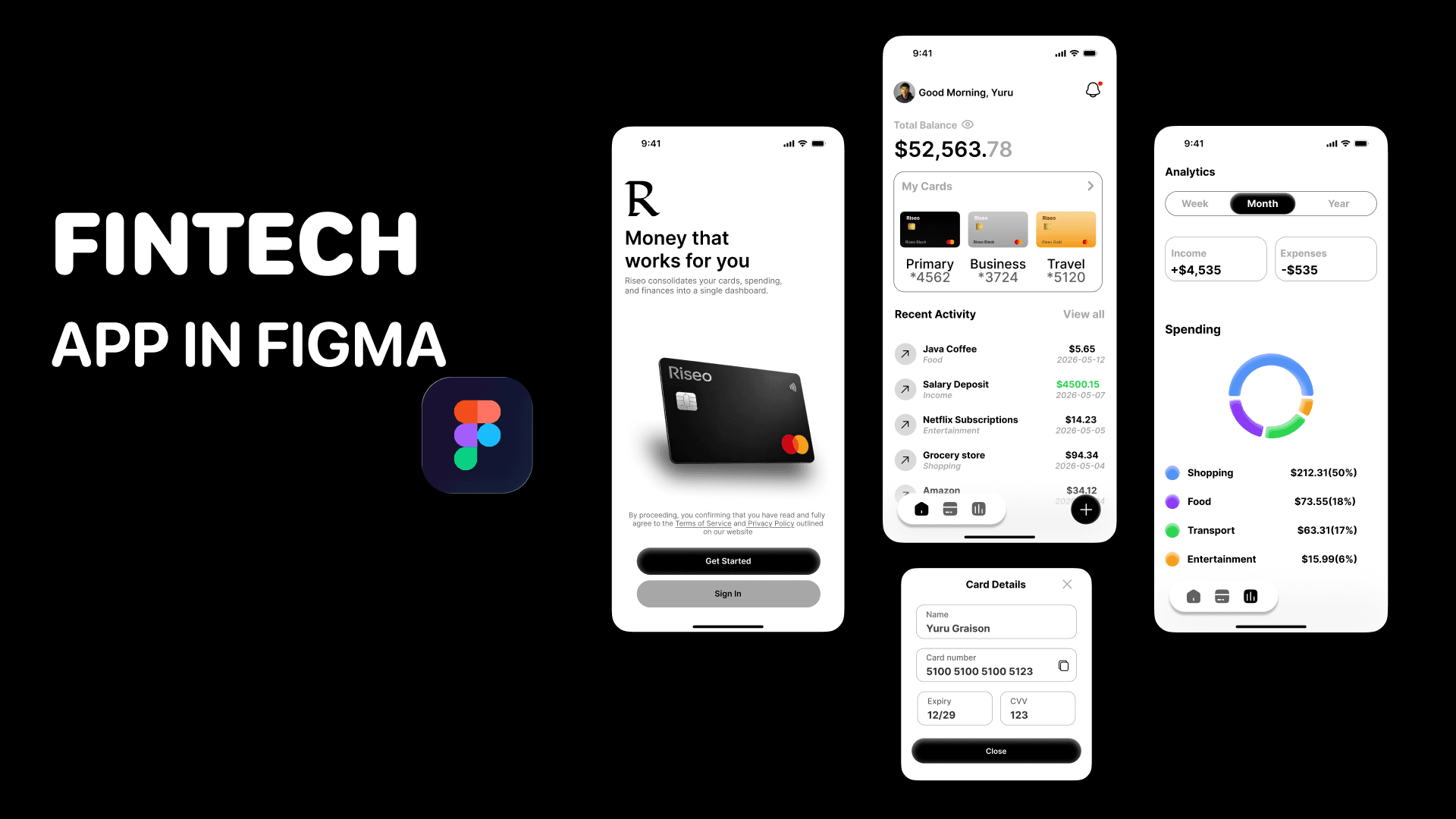
Crypto3
Your portfolio. Crystal clear.

The Problem
Crypto apps have a design paradox. They need to be simple enough for someone checking their balance on a matatu, and precise enough for someone executing a swap where a 0.5% slippage setting actually matters. Most apps pick one audience and abandon the other.
The result? New users feel lost. Experienced users feel slowed down. And everyone feels like one wrong tap could cost them money.
That fear is a design failure. That's what Crypto3 set out to fix.
Who I Designed For
A 24-year-old mobile-first investor in Nairobi managing $20,000+ across three assets USDT, Ethereum, and Bitcoin. He checks his portfolio daily, swaps occasionally, and makes decisions based on weekly price trends. He's not a trader by profession. He's someone who got into crypto and needs an app that respects his intelligence without overwhelming it.
The Core Design Challenge
Three screens. Three completely different user needs:
Home — Give me my financial picture in 3 seconds
Asset Detail — Help me decide whether to act on this coin right now
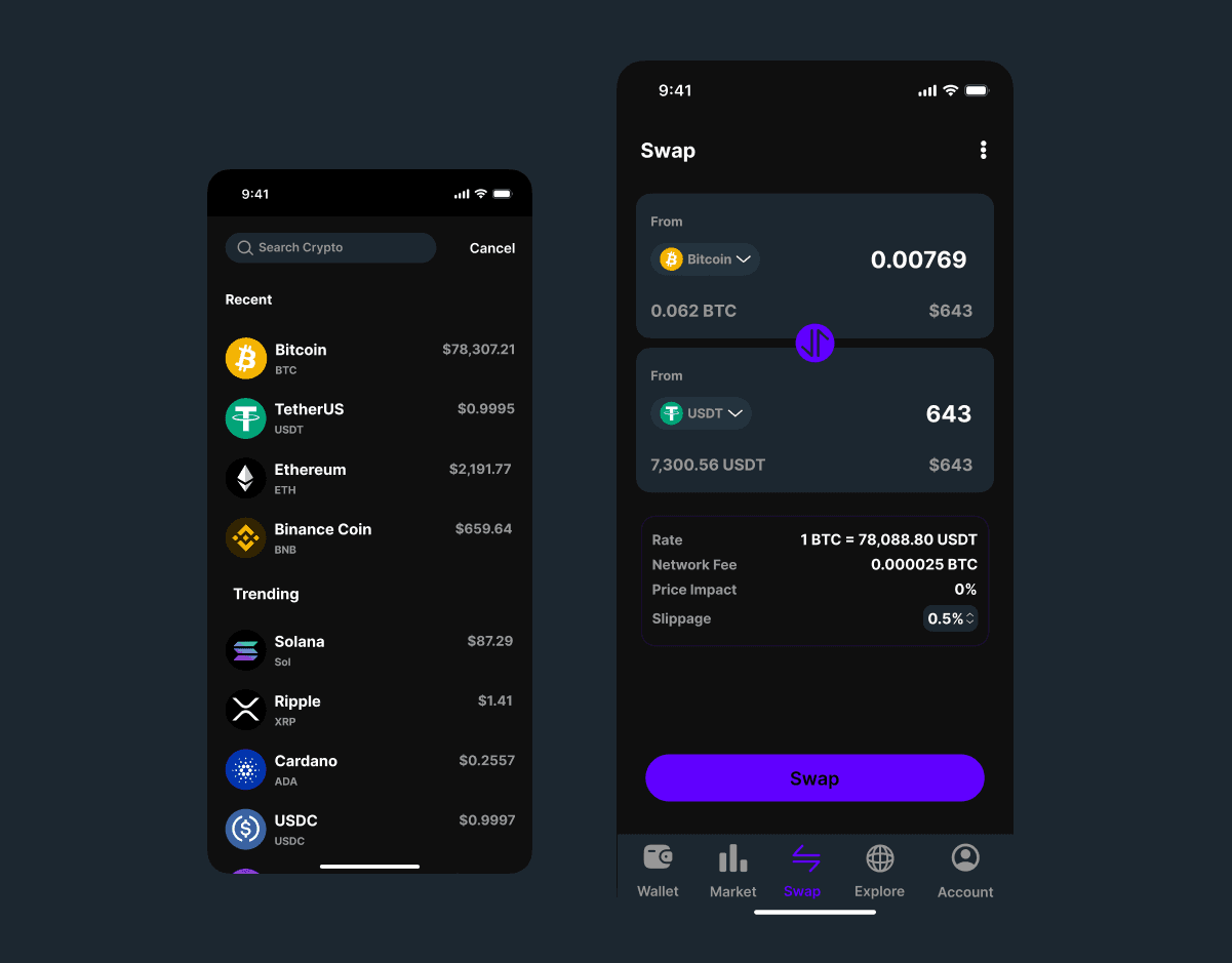
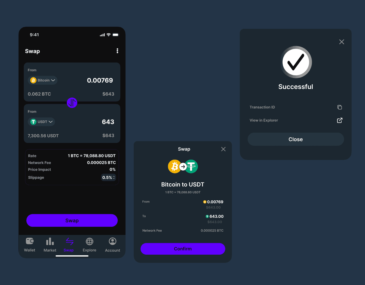
Swap — Let me execute a complex transaction without second-guessing myself
Each screen had to nail its one job without leaking complexity from the others.
The Design Decisions That Mattered
1. The balance card sets the emotional tone immediately. $23,093.80 large, confident, impossible to miss. The +3.45% gain sits directly below in green. Before the user reads anything else, they know two things: what they have and whether today is a good day. That emotional orientation in the first two seconds is intentional. A user who opens an app and immediately feels informed is a user who trusts the app.
2. Five actions, zero navigation. Receive, Send, Swap, Buy, More every primary action a crypto user needs is one tap from the home screen. No digging through menus, no sub-navigation. The actions sit between the balance and the asset list because that's the natural reading flow: here's what you have → here's what you can do with it.
3. The asset list does two jobs at once. Each row shows the coin name, holding amount, current value, and 24h change. That's four data points per asset in a single scannable row. A user can assess their entire portfolio three assets in under five seconds. The green percentage figures are the only color on the home screen, which means the eye goes there first. Gains are celebrated; losses are readable without being alarming.
4. The price chart is the decision-making tool. On the Bitcoin detail screen, the red candlestick chart takes up nearly half the viewport. This wasn't an aesthetic choice it was a functional one. The chart is the reason a user taps into an asset. They want to see the trend before they act. Burying it below the fold would mean the most important information arrives last. The 1D / 1W / 1M / 3M / 1Y time filter lets users zoom in or out on their own terms, without leaving the screen.
5. The Swap screen turns a high-anxiety action into a confident one. Swapping crypto is the highest-stakes action in the app. Get it wrong and you lose money. The design addresses this directly: the flow is linear From → To → Rate confirmation → Swap. Every fee, rate, and impact figure is shown before the user commits. Nothing is hidden in a tooltip or collapsed behind a "Show details" link. The purple Swap CTA is the only strong color on the entire screen a deliberate signal that this is the point of no return, and it should feel intentional, not accidental.
6. Dark theme as a functional decision. Dark UI isn't a trend choice here it's a readability choice. Green gains and red losses need to pop instantly. On a dark background, a +1.45% in green and a -$2,303.96 in red are immediately legible without the user having to focus. In a financial app, the speed at which someone reads a number matters.
The Outcome
A three-screen Figma prototype covering the complete core user journey portfolio overview, asset detail with live price chart, and token swap with a consistent dark design system built for clarity under pressure.
More importantly: a design where a user can open the app, assess their portfolio, research an asset, and execute a swap all without ever feeling lost or unsure. Reducing anxiety in a high-stakes product is the design win.