QuickBite Food Delivery App
A premium food delivery experience built to feel craveable while browsing and reassuring while waiting.

Overview
Food delivery apps solve a strange design problem: they have to sell an appetite before a single bite exists. Most treat that moment like inventory management grids, filters, price tags and lose the thing that actually drives the tap: craving.
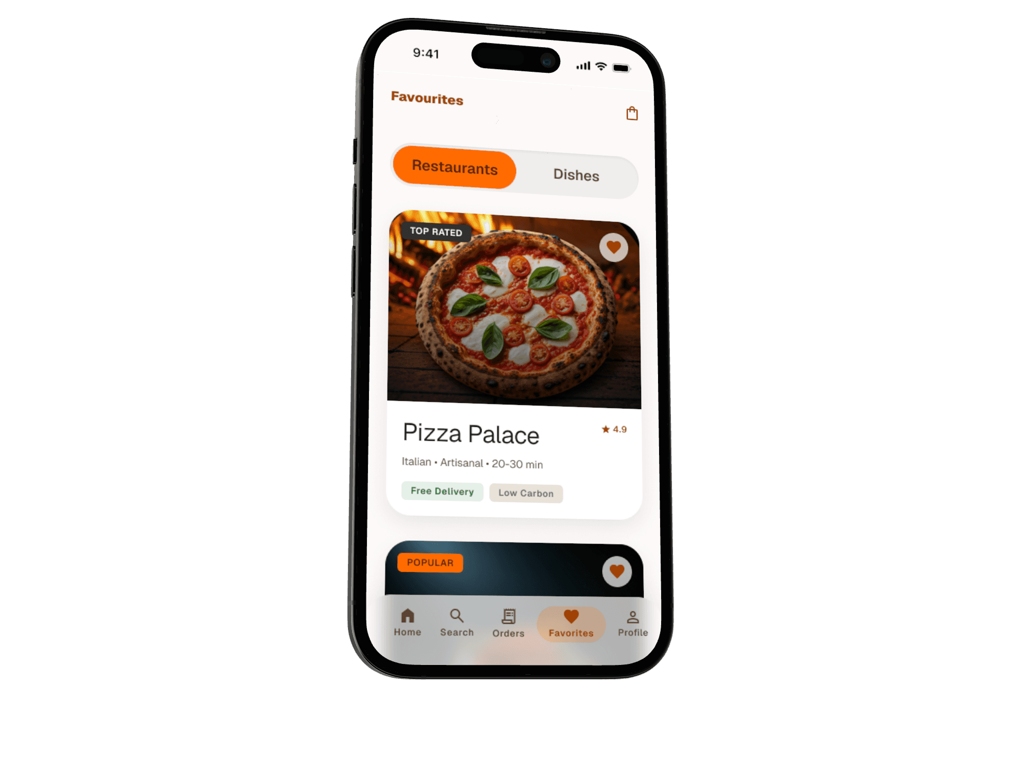
I designed QuickBite end-to-end across 15 screens spanning five connected flows, built around a simple thesis: the app should look and feel like food until the moment you need it to look and feel like logistics.

The Problem
Delivery apps tend to fail at one of two moments:
Browsing, where food gets flattened into a scrollable catalog small thumbnails, dense text, filters up front optimized for search efficiency at the cost of appetite.
Waiting, where the app goes quiet right when anxiety is highest is it actually being made, is the rider close, did the order even go through?
QuickBite needed to be genuinely craveable in the first moment, and genuinely reassuring in the second two very different emotional registers, held together by one consistent visual system.

Design Approach
I broke the product into three sequential jobs:
Craveability first. Browsing should feel like looking at food, not scanning a database, full bleed photography, minimal chrome, warmth in every surface.
Confidence during the wait. Once an order is placed, every screen exists to answer "is this actually happening?" before the user has to ask.
Frictionless return visits. The best delivery app is the one you don't have to think about the second time favorites, fast reorder, and visible loyalty progress.
Flow 1 — Onboarding & Auth
The splash screen sets the tone immediately: a warm illustrated hero (a delivery cloche mid-motion, ringed by an orange arc) paired with the line "Delicious food, delivered to your door" — appetite and speed, established before any UI chrome appears. Sign Up and Login sit one tap away from each other with a clear "Already have an account?" bridge, keeping the two paths from ever feeling like a fork in the road.
The detail I'm proudest of here is "Preparing Your Experience" — a branded loading state between login and home, rather than a generic spinner. It's a small moment, but it reframes a dead-time screen into a continuation of the brand's warmth, and it primes the user for a personalized home screen rather than a jarring jump straight into a data-dense dashboard. Returning users get their own "Welcome Back" moment instead of repeating the full auth ritual.
Flow 2 — Home & Discovery
Home opens with context, not a menu: "Deliver to 221B Baker Street, London" pinned at the top, followed by a personal greeting — "Good evening, Ian" — before anything transactional appears. This ordering matters: location and identity first, choices second.
The hero promo banner (Weekend Special, 50% off, full-bleed burger photography) does double duty as both a conversion driver and a tone-setter for the whole browsing experience — it's the first food the user sees, and it's meant to look irresistible, not like an ad unit. Below it, category selection uses circular food photography instead of generic line icons (Burgers, Pizza, Sushi, Healthy, Dessert), so even navigation is doing craveability work. Popular Restaurants closes the screen with delivery-time estimates surfaced up front, since speed is often the actual deciding factor once appetite is already won.
Flow 3 — Food Details & Ordering
This is where craveability has to hold up under scrutiny. The food photo runs full bleed and edge-to-edge at the top of the screen utility controls (back, favorite, share) float over it in soft translucent circles rather than a hard header bar, so nothing interrupts the image itself.
Directly beneath the photo, the metadata that actually drives a decision 4.8 rating, 120 reviews, 15–20 min sits in one scannable line, followed by a plain-language description and an ingredient breakdown shown as individual icon chips (kale, quinoa, roasted sweet potato, grilled chicken). That ingredient-level transparency is a deliberate trust signal for a "Healthy" category item it answers "what am I actually eating" without forcing the user into a nutrition-label wall of text. From here, Cart & Checkout keeps the same warm visual language rather than switching into a cold, transactional form.
Flow 4 — Order Confirmation & Tracking
This flow exists to solve the anxiety gap most delivery apps leave open. Order Successful gives immediate, unambiguous confirmation the moment payment completes no waiting to wonder if the tap registered. Order Tracking Details then carries that reassurance forward with a live map view, replacing the silent gap between "ordered" and "arrived" with continuous visibility. The goal across both screens is the same: never let the user's last clear signal be more than a few seconds old.
Flow 5 — Account, History & Loyalty
The retention layer is deliberately lightweight. User Profile and Order History make repeat ordering close to a one-tap action the app already knows what you liked last time. Loyalty Rewards surfaces points progress directly (2,450 points, visible from the navigation itself) rather than burying it in a settings menu, treating loyalty as an ambient, always-visible part of the experience instead of a separate program the user has to seek out.
Design System
QuickBite runs on warmth: a signal-orange accent (used for CTAs, active states, and promo moments) against a soft cream background, letting food photography carry the color story rather than the UI itself. Rounded, friendly typography reinforces the appetite-first tone, while a single green "Healthy" tag and gold star ratings act as the only other accent colors in the system reserved specifically for dietary signaling and trust metrics, so they stay meaningful rather than decorative.
What This Project Demonstrates
QuickBite required holding two different emotional jobs seduction and reassurance inside one coherent system, without either one diluting the other. Designing it end-to-end meant treating photography as a primary design material, not a content placeholder, while still solving the unglamorous but critical parts of the experience: order anxiety, repeat-use friction, and account management. That balance knowing when to let the food speak and when to get out of the way with clear, calm UI is the core skill this project is built to show.

