Tian Fashion App
Style that moves with you.

The Problem
Fashion e-commerce apps have one brutal conversion problem people browse endlessly and buy rarely. The gap between "I like this" and "I'm buying this" is where most apps lose their users. Unclear sizing, weak product presentation, and clunky checkout flows all create enough friction to kill the purchase decision.
Tian Fashion was designed to close that gap.
Who I Designed For
A style-conscious shopper in their mid-20s who buys clothing on their phone during commutes, lunch breaks, and late evenings. They're visually driven they decide within seconds whether a product is worth their attention. They abandon carts the moment something feels slow, confusing, or untrustworthy.
They don't need more products. They need a faster path to the right one.
The Core Design Challenge
Three screens. Three moments in the purchase journey where users most commonly drop off:
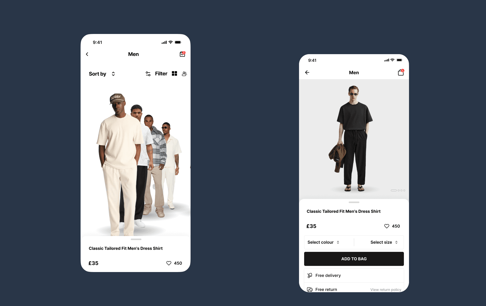
Discovery (Runway) — Can I find something I want without effort?
Browse (Men's category) — Can I narrow down quickly without feeling overwhelmed?
Product Detail — Can I make a confident purchase decision without leaving the screen?
Each screen had to eliminate the specific friction that kills conversions at that stage.
The Design Decisions That Mattered
1. The Runway screen leads with editorial photography, not a grid. The home screen opens with a full-bleed fashion photograph a model, not a product on a white background. This was a deliberate emotional choice. Fashion is aspirational. Users don't just buy clothes they buy the version of themselves wearing those clothes. Leading with a lifestyle image creates that aspiration before a single product is shown. The "Categories" section below gives structure once the mood is set.
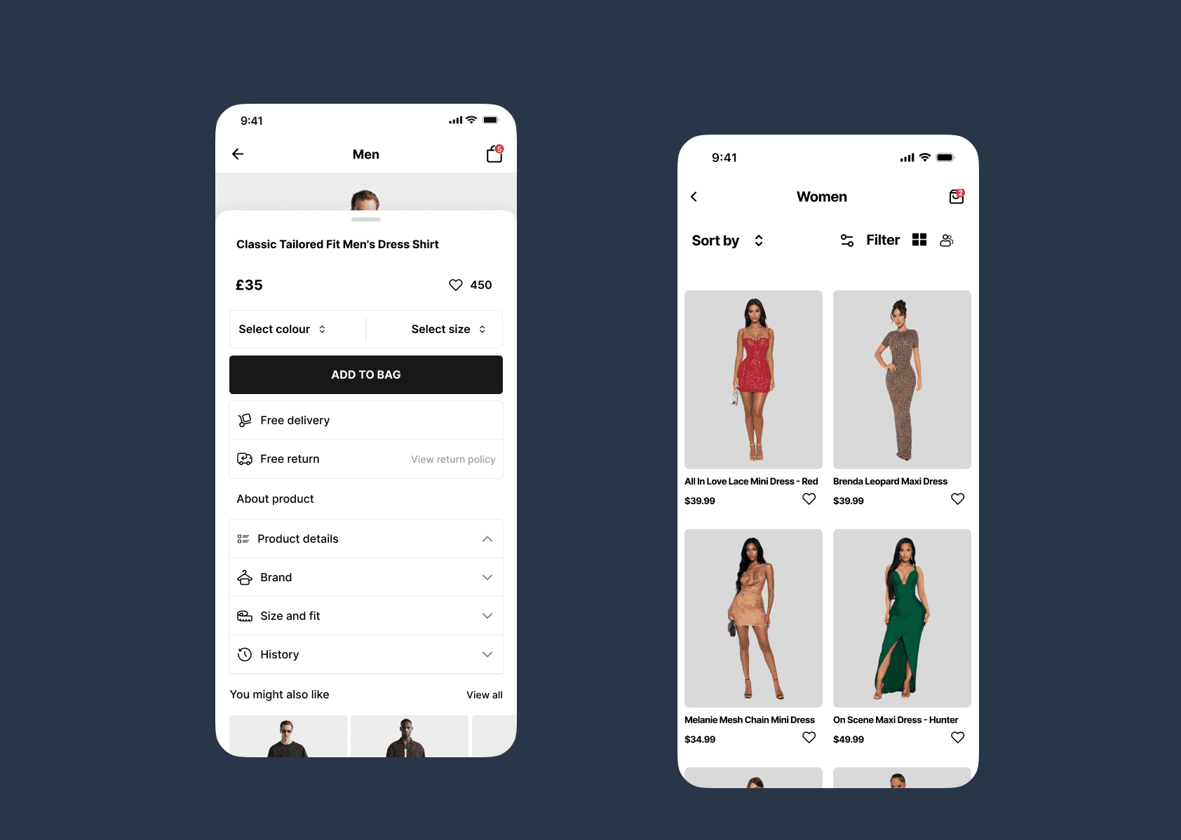
2. The product grid respects how people actually browse. The Men's category uses a two-column asymmetric grid with product photos shot on models not mannequins, not flat lays. Real people wearing real clothes. This matters because users are subconsciously asking "will this look good on me?" and a model gives them a reference point a hanger never can. Price sits directly below each item, visible without tapping. No hunting for information.
3. Sort and Filter are accessible but not intrusive. The filter icon and sort option sit at the top of the browse screen reachable when needed but not dominating the layout. Users who know what they want can narrow quickly. Users who are browsing can ignore them entirely. The design doesn't force a decision before the user is ready.
4. The product detail sheet answers every purchase question on one screen. Name, price, color selection, size selection, delivery information, return policy everything a user needs to commit to a purchase is visible without scrolling. "Add to Bag" is a full-width black button unmissable and authoritative. "Free delivery" and "Free return" sit directly below it as trust signals, addressing the two biggest anxieties in online fashion purchases cost and risk at exactly the moment they matter most.
5. White and black as the design system foundation. Fashion brands live and die by their visual identity. A neutral white and black palette puts the clothing and the photography at the center of every screen. The UI never competes with the product. It steps back and lets the clothes sell themselves.

The Outcome
A three-screen Figma prototype spanning the complete discovery-to-purchase journey editorial home, product browse with filtering, and a conversion-optimized product detail sheet with a clean, scalable design system built around the product, not the interface.
The design prioritizes one metric above all others: getting a user from "I like this" to "I bought this" in as few taps as possible.